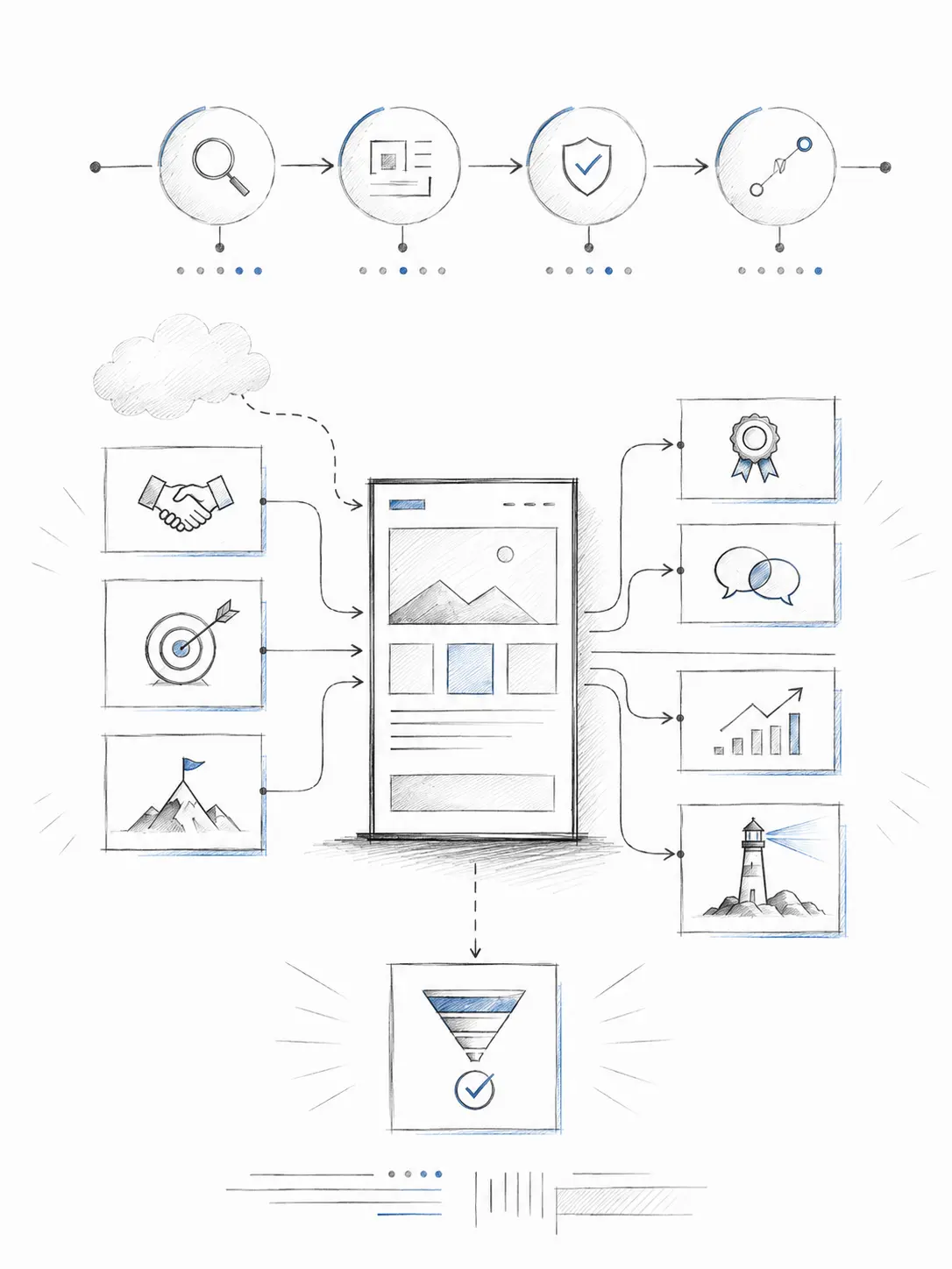
Conversion rate matters.
For many businesses, especially SMEs, a website is expected to support sales, generate enquiries, or help customers move closer to making a purchase.
That is perfectly reasonable.
An e-commerce website should help people buy. An online catalogue should help customers explore products. An online showroom should help potential buyers understand what a company offers.
In these situations, conversion is naturally an important measurement.
But I think we have become so used to talking about website conversion that we sometimes overlook a more basic question:
Is conversion the only job a business website should perform?
I do not think so.
A website can generate enquiries, but it can also shape how people perceive a company.
It can help customers understand the business.
It can support a sales team.
It can strengthen corporate credibility.
It can reduce uncertainty.
And sometimes, before a customer is ready to contact you, the most important job of your website is simply to make your company look credible enough to remain under consideration.
Conversion is one outcome.
Trust, clarity and credibility are often what make that outcome possible.
Why Businesses Became So Focused on Website Conversion
There is a good reason businesses pay attention to conversion.
A website requires investment.
Management naturally wants to know whether that investment produces results.
How many visitors became enquiries?
How many people clicked WhatsApp?
How many submitted a form?
How many purchased?
These are useful questions.
The problem starts when we assume that every visitor must immediately take an action for the website to have value.
Business buying decisions are not always that simple.
A potential customer may visit your website today and contact you two weeks later.
A procurement manager may check your company before adding you to a shortlist.
A business owner may look at your website, send it to a partner and discuss your company internally.
A candidate may visit before deciding whether to apply for a position.
A potential distributor, investor or business partner may visit simply to understand whether the company appears established and credible.
None of these actions necessarily produces an immediate form submission.
But they still matter.
This is why I believe businesses should be careful about reducing website performance to a single metric.
A Website Can Serve More Than One Business Purpose
Before designing or redesigning a website, companies should first decide what the website is supposed to achieve.
Depending on the business, a website may support several purposes.
It may help with:
- Lead generation
- Sales support
- Product or service education
- Corporate branding
- Customer confidence
- Recruitment
- Partner confidence
- Market positioning
- Customer service
- Long-term digital visibility
The important point is not that every website must perform all these functions.
It is that every website should have a clearly understood purpose.
A website built mainly for enquiry generation should be designed differently from a corporate website built mainly to strengthen credibility.
A product catalogue should be structured differently from an investor-facing corporate website.
A professional services firm may depend far more heavily on expertise, credibility and trust than on aggressive calls to action.
There is no single correct formula for every business website.
The correct design depends on the decision the website needs to help people make.
The Overlooked Role of Brand, Credibility and Trust
One of the most overlooked purposes of a business website is trust.
Many companies think of branding mainly in visual terms.
Logo.
Colours.
Photography.
Fonts.
These things matter, but corporate credibility goes deeper than appearance.
When someone visits a company website, they are constantly forming judgments.
Does this company look established?
Do they appear to understand what they are doing?
Is the information clear?
Does the business appear active?
Can I find evidence of its experience?
Do its services make sense?
Does the website feel maintained?
Would I feel comfortable contacting this company?
These questions may never be consciously expressed by the visitor.
But they influence behaviour.
A website is often one of the first places where customers verify whether the impression they have of a company matches reality.
That is why professional image is not simply decoration.
It contributes to confidence.
And confidence affects whether people continue the conversation.
“We Only Need a Simple Website”
Over the years, I have often heard clients say:
“We only need a simple website. We don’t need anything complicated.”
There is nothing wrong with wanting a simple website.
In fact, I generally agree.
A good website should feel simple.
The misunderstanding begins when people assume:
Simple = Cheap
and
Complex = Expensive
These are not the same thing.
In website design, simplicity is not necessarily about how little work is involved.
It is about how little effort the user needs to make.
A website can have only five pages and still be confusing.
Another website may contain hundreds of pages but still feel easy to navigate because its structure has been carefully planned.
The number of pages does not determine simplicity.
The number of features does not determine simplicity.
The real question is:
How easily can the user achieve what they came to do?
Simple Does Not Mean Cheap
I like to explain it this way:
Simple is a design outcome.
Cheap is a pricing decision.
They are two different things.
Consider the iPhone.
One of the reasons many people find it easy to use is that the interface removes unnecessary decisions.
You do not need dozens of visible buttons to perform basic tasks.
The experience feels simple.
But nobody assumes that because the product is easy to use, it should therefore be the cheapest phone in the market.
In fact, achieving simplicity often requires more thought.
The same applies to websites.
Before a website can feel simple, someone has to decide:
What information matters most?
What should appear first?
What should be removed?
How should the navigation work?
What questions will customers have?
Where should users go next?
What should appear on mobile?
How do we make a large amount of information understandable without overwhelming the visitor?
Adding things is relatively easy.
Removing unnecessary complexity is harder.
Complexity is easy to add. Clarity takes work.
What Simplicity Really Means in Website Design
To me, a simple website is not necessarily a small website.
It is a website that is easy to understand and easy to use.
A visitor should be able to understand, reasonably quickly:
Who is this company?
What does it do?
Who does it serve?
Why should I pay attention?
Where can I find more information?
What should I do next?
Good UX and UI are not about making websites look fashionable.
Their purpose is to reduce friction.
A visitor should not have to hunt for basic information.
They should not have to guess what a button means.
They should not need to open five different pages before understanding what the company actually provides.
The job of design is not to make the visitor admire the interface.
The job of design is to help the visitor move through information with as little unnecessary effort as possible.
That is what I mean by simplicity.
Complexity Is Not the Same as Value
There is another misconception I often see.
Some businesses assume that a website becomes more valuable when it has more features.
More animation.
More pages.
More functions.
More visual effects.
More technology.
Sometimes those things are useful.
Sometimes they are unnecessary.
A complex feature is valuable only when it solves a real business or user problem.
If it does not, it is simply additional complexity.
The same principle applies in the opposite direction.
A website that looks visually minimal may require substantial work behind the scenes.
There may be strategy.
Content planning.
User research.
Information architecture.
Responsive design.
Accessibility considerations.
Search optimisation.
Performance work.
Security.
Content management planning.
Testing.
A visitor may never see the complexity behind the website.
That is often a sign that the work has been done properly.
Good design hides unnecessary complexity from the user.
A Website Should Help People Make Decisions
This is how I increasingly think about business websites.
A website is not simply a place to store company information.
It is a place where people form decisions about the company.
The visitor may be deciding:
Should I trust this business?
Should I contact them?
Should I include them in the shortlist?
Should I ask for a quotation?
Should I recommend them internally?
Should I work with them?
Should I apply for a job here?
Should I continue researching?
Seen from this perspective, website design becomes less about decoration and more about decision support.
The website needs to help a person move through a simple journey:
Find you → Understand you → Trust you → Decide what to do next
Conversion is part of that journey.
But conversion usually comes after understanding and trust.
If the visitor does not understand what you do, the CTA will not solve the problem.
If the visitor does not trust the company, adding another enquiry button will not solve the problem either.
So What Should a Business Website Actually Do?
There is no universal answer.
For one company, the most important purpose may be generating qualified enquiries.
For another, it may be presenting technical capabilities clearly.
For a corporate organisation, credibility may be more important.
For a professional services firm, demonstrating expertise may matter most.
For a manufacturer, helping customers understand capabilities, products, certifications and markets may be the priority.
For an established company, the website may need to support many audiences at the same time.
That is why I believe one of the most important questions should come before design begins:
What business decision should this website help someone make?
Once the purpose is clear, many other decisions become easier.
What content is needed?
What pages should exist?
What should be shown first?
What proof should be included?
What should the call to action be?
What information is unnecessary?
Design becomes much easier when the purpose is clear.
Final Thought: Define the Purpose Before Designing the Website
A website should not exist simply because every company is expected to have one.
And it should not automatically be judged only by how many people immediately submit an enquiry.
Conversion matters.
But so do clarity, credibility, positioning and trust.
Sometimes the website’s job is to generate an enquiry today.
Sometimes its job is to help the customer feel confident enough to include your company in tomorrow’s discussion.
Both have business value.
So before asking:
“How much will the website cost?”
or even:
“What conversion rate can we achieve?”
I think there is a more important question to ask first:
What exactly do we want this website to do for the business?
Because a good website is not simply a collection of pages.
It is a business asset designed with a purpose.